Has Microsoft hobbled Windows Phone 7 Series before it’s even released?
Microsoft is nearly at the end of its launch of its brand new mobile operating system, Windows Phone 7 Series. And I do mean brand new – absolutely everything about WinMo 7 is new, from the user interface right on down to the underlying code.
Even the name is new – out goes WinMo, in comes, er, WinPho!
And what a hugely welcome relief this is! The old Windows Mobile was creaking so badly, it was beyond repair. Thankfully, Microsoft realised this and have raised their game, producing a brand new mobile OS with a new user interface that’s at least as good as the other interfaces that are now on the market.
If only Nokia had done that with Symbian!
But that’s another story. The story of the day is what WinPho7 offers, how good it is – and why Microsoft might just have hobbled it before it’s even had a chance to succeed!
Ye Olde Windows Mobile 6
Windows Mobile 6 was designed for a different age of mobile phones, an age when smartphones were PDAs, designed for business use such as organizing inboxes, contact details, notes, ToDo lists, calendars and Word documents.
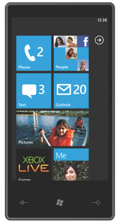
Today’s smartphones are all about personal, though, from social networks through to personal productivity and personal memories. Apps, music, Facebook, Twitter, videos, pictures, you name, today’s smartphone needs to have it, and it needs to have a touchscreen user interface with an extremely usable user interface if it’s going to compete.
Windows Mobile 6 was not a mobile OS to to do all that! Windows Phone 7 Series, on the other hand, clearly is.
Windows Phone 7 Series Overview
Microsoft have thrown pretty much everything they’ve got at WinPho 7, including most of their other gadgets and software that they’ve got. Here are some of the highlights:
- Brand new, completely redesigned UI
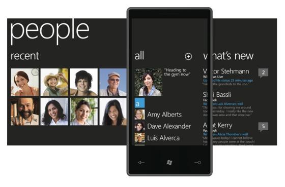
- Tight integration with social networks through what Microsoft are calling Integrated Experiences Hubs (hmmm, now that trips off the toungue!)
- Games Hub, featuring built-in XBox Live functionality
- Music Hub, featuring Zune HD – in fact, every WinMo7 phone is a Zune HD in disguise
- Office Hub, featuring a brand new version of Microsoft Office for Mobile
- Pictures Hub, with local pictures and pictures from social networks such as Facebook all integrated into the same photo-gallery app
- People Hub – the inevitable social network app, in which all of your friends’ status updates are brought together in the same app
- New version of Microsoft IE for Mobile
- 4-point multitouch support
- Super-sleek minimalist UI
- Superb font display using Pixel Positioning, which is better than Windows ClearType
- Pinch-zooming
- Local search via Microsoft Bing
- Stripped down (boring?) homescreen that shows the info you need at a glance
There are some pretty meaty chunks to digest here, so let’s get down to the details.
Total integration with other Microsoft products
With Zune, XBox, Bing and Office all tightly integrated into WinPho7, there’s no doubt this is a pure Microsoft OS! In fact, it uses so much of Microsoft’s technology, it could be put off people who aren’t solely reliant on Microsoft products.
Bing, for example. Who uses Bing? Literally, no-one! So although you could argue WinPho7 is a good way of introducing a new audience to Bing, you could also argue that reliance on an unused search engine is a weakness in WinPho7’s armour – why use a phone that doesn’t use Google, when every other phone on the market does?!
The same goes for the Zune, which had to be explained to the audience during Microsoft’s keynote, as it’s not sold across all of Europe. In other words, it’s an unsuccessful MP3 player that was an iPod wannabe, but which never really caught on.
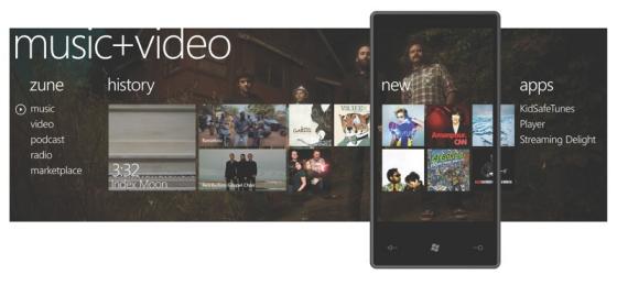
Again, not exactly a big selling point!
Tight support for Office is obviously a much bigger deal, and the XBox Live integration is also a good call – but only if you’ve got an XBox 360 at home!
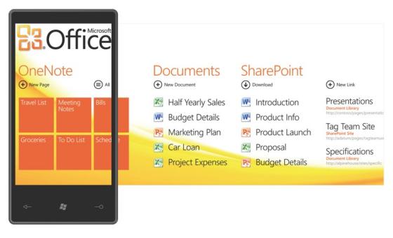
If you don’t care for these Microsoft products and are aware that there are much better alternatives on the market, then this could be a big turn off for some users. Bringing all of them together in the one mobile OS, which itself has a very uncertain future, is a big risk for Microsoft.

New user interface
At least the new user interface looks good. The use of Hubs, in particular, has been well thought through, and the design of each Hub is intuitive and actually rather good.
A Hub essentially frames the content it presents according to the specific activities the user wants to do. So, for example, not only does the Picture Hub let you view photos from the phone’s gallery and from Facebook, you can also upload your phone’s pics to Facebook directly from the Picture Hub.

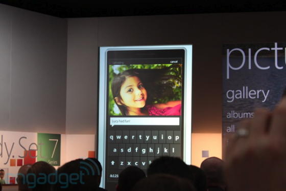
Although Microsoft only presented a prototype, the device seemed snappy and the user interface itself was extremely intuitive.
Just one more thing – and it ain’t pretty!
Windows Phone Series 7 is a dramatic transformation over Windows Mobile 6, and it needed to be. WinMo6 was so over the hill, it was laughable. With WinPho7, Microsoft have a chance to put that right and finally compete in the mobile space.
Except they might just have hobbled WinPho7 before it’s even begun. Microsoft have locked down the OS tightly. So tightly, in fact, they’ve killed innovation before it can begin.
They’ve dictated a rigid series of hardware specs that must be used as a minimum for any mobile phone to use WinPho7. Nothing wrong with that – Android does the same. It’s the only way you can ensure a consistent user experience across different phone models all using the same OS.
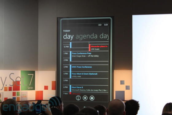
But then Microsoft has gone one stage further and also dicated there must be no customizations of WinPho7 from either carrier or phone manufacturer.
In other words, no Sense UI, TouchWiz or any other new user interface on any WinPho7 device. What you see here is WinPho7 and every WinPho7 phone, no matter what manufacturer makes it, will all look like this.
Seriously?! Microsoft wants an army of clones, with no innovation occurring in the user experience? What sort of crazy thinking is this?
Apple can get away with this level of control because an iPhone is an Apple iPhone – Apple makes the phone, so of course the interface is the same whatever iPhone you use.
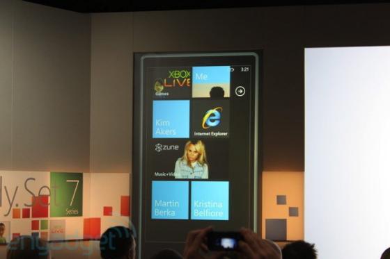
But if a Sony Ericsson WinPho7 phone looks the same as an HTC WinPho7 phone, or a Garmin-Asus, or a Samsung or an LG, then the term “Windows Phone 7” becomes a meaningless commodity – once you’ve seen one, you’ve seen them all.
Android, in contrast, is completely open, and has given rise to a wealth of new UIs on top of the stock Android UI. Whether it’s Sony Ericsson’s Rachel, HTC’s Sense UI, Samsung TouchWiz, Motorola’s MOTBLUR or even Google’s own UI on the Nexus One, they’re all different, and they’re all glorious!
WinPho7 could have been too. It could have allowed for this kind of openness and brought out innovation from other companies. But instead, it’ll stagnate, with only the features of a phone distinguishing it from any other – exactly like what happened with earlier WinMo phones.
Sigh! Just when you think a company gets it, it goes and royally cocks it up!
Windows Phone 7 Series release date will be around the Holiday Season, which I guess will be Christmas 2010. I can’t help but wonder what kind of mobile phones will be on sale in a year from now, given the wonders we’ve already got on the market now!
[Engadget]


