In-depth 17 minute video review of Windows Phone 7 Series
Microsoft teased us at MWC 2010 last month with its new Windows Mobile 7 Series. Although we saw quite a few screenshots of the new mobile OS, the videos that were shown were frustratingly brief.
Today at last, our frustration can be relieved as Chris Pirillio has posted a 17 minute video of a hands on session he had with Windows Phone 7 Series, as demonstrated by a Microsoftie.
More details and the video after the jump.
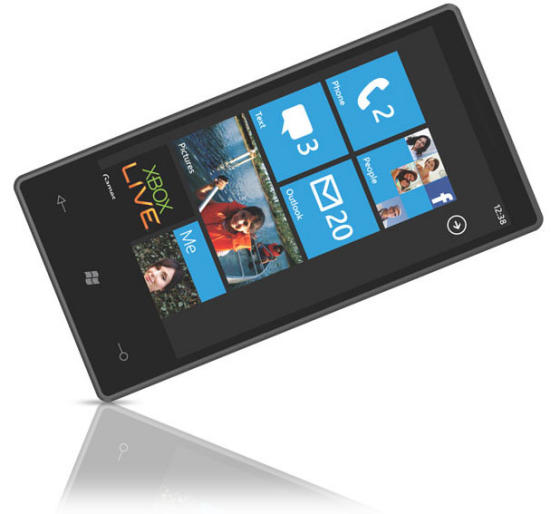
Although not the finished product (Windows Phone 7 Series isn’t set to ship until “the holidays” 2010, although curiously Microsoft isn’t saying which holidays!), the video shows Windows Phone 7 Series working effortlessly on an unbranded touchscreen device.
What’s great about Windows Phone 7 Series
The first thing that hits you about the overall user experience is just how polished it is. The transitions in particular are brilliantly executed witha real fluidity of movement between one app’s screen and another.
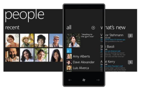
Indeed, the transition from one app to another is so fluid you lose all sense of individual apps and just the phone as a single device that gives you easy access to all the content that’s personal to you: people, music, videos, photos, status updates, whatever it is that’s important to you.
Microsoft should be congratulated for this. With so many smartphone user interfaces now available, each doing essentially the same thing, it takes something exceptional to stand out from the crowd. With Windows Phone 7 Series, Microsoft has pulled this off with aplomb.
However, it’s not all roses.
What’s not so great
Overall corporate feel
The feelin I get after watching the video is of a beautifully fluid user interface, but that’s a little too, well, corporate. Take Outlook, for example. Obviously Microsoft were going to use Outlook as the email client, but everything about Outlook screams “work”.
The look and feel of Outlook on Windows Phone 7 Series is pretty much exactly what you get on the desktop version, but that’s where most of us see our work email! In other words, the first thing I think about when I see that damn email client is work and all the pressures that work’s email brings with it.
Not what I wanted to be reminded of 24/7!
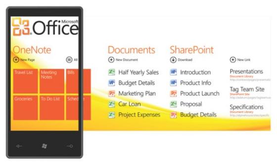
The same goes for many of the other apps. Although I love the minimal look, in too many areas the overall impression is just too corporate – it’s a polished look, but one that ends up looking completely sterile. Even trivial details like the font, for example, belong on a corporate brochure.
Too much emphasis on Microsoft
Another problem is Microsoft’s narcisstic obsession with Microsoft. Obviously Bing is the search engine rather than Google, which would be OK if it was any good. But for general search queries it’s not, which kind of limits the use of the phone a bit!
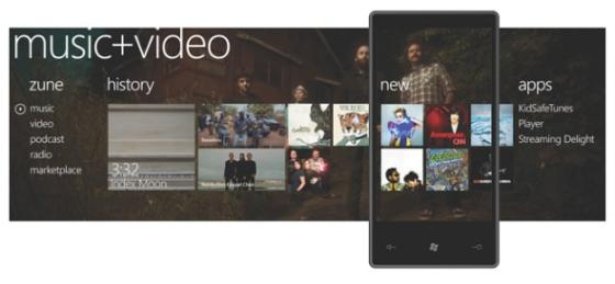
It’s the same story with the music and video player. It’s Microsoft Zune. Not just designed to look like Microsoft’s ill-fated Zune MP3 player – it is Zune!
The latest version of Zune apparently isn’t bad, but we in Europe don’t know as Microsoft forgot to release it over here! So we just have memories of a crap MP3 player, if we have any memories at all!
Then there’s the authentication and payments system. It’s all based on Windows Live. Want to buy an app for your phone? You need to have a Windows Live account, and associate a credit card with it.
Same with the gallery. Although Microsoft are showing off how the photos come from many different sources, not just from the phone, the truth is those sources are predominantly Microsoft sources. The phone, the desktop, Windows Live, and Facebook (which isn’t a Microsoft property, but which is closely allied to Microsoft).
There’s no Flickr or Picasa integration. Everything, as ever, has to be Microsoft.
And this is where Windows Phone 7 Series really lets it down while at the same time, showing Microsoft’s true colours. In Microsoft’s world, there’s only ever been Microsoft. Other services don’t exist and certainly shouldn’t be used.
So absolutely everything one Windows Phone 7 Series is Microsoft-based, irrespective of how good the actual service is.
However, the reality of smartphones in 2010 is that they’re embracing the mobile Web like never before – and the mobile Web, like the Web itself, doesn’t give a hoot for any one company. It’s all about sharing, interoperation, collaboration, remixing and mashups.
Not about tying everything down to one vendor.
The economics of the desktop with its big monolithic applications and operating systems never worked on the Web, and they won’t work on the mobile Web (no matter what Apple, never mind Microsoft, may think!)
No differentiation
The final problem I have with Windows Phone 7 Series is the way Microsoft are restricting its customization. Phone manufacturers have been given a precise list of hardware specifications their phones must meet, and are told they can’t interfere with the standard user interface you see here.
Which does kind of mean that every Windows Phone 7 Series phone will look like every other Windows Phone 7 Series phone!
I guess this is Microsoft’s attempt to follow Apple’s business model and avoid the variety offered by Android.
But since when was variety a problem? When Microsoft let vendors customize the old Windows Mobile OS, we were treated to the glorious HTC Sense UI found in the HTC HD2 and other WinMo (and now Android) phones. How is that a bad thing?!
This does at least make future Windows Phone7 Series review extremely easy to write. The first review will be extremely detailed, with screen captures, videos, specs, ease of use, overall experiences described, etc.
The second review?
“Like the phone in the first review, but a bit faster”!
[Source: Chris Pirillo via TracyAndMatt]




![This is no ordinary HTC Desire HD review! – [Hands-on, with video] HTC-Desire-HD-01](http://www.mobilementalism.com/wp-content/uploads/2011/02/HTC-Desire-HD-011-326x132.jpg)

