Japanese triple-screen concept phones
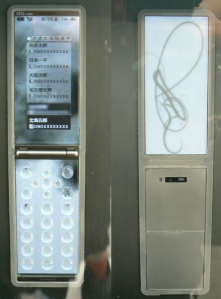
Twin-screened phones are so last year. What people really need is a phone with three screens. Well, at least according to Japanese mobile phone operator Au KDDI, anyway. Au have released details of some fantastic looking concept phones, some of which might even make it to market.
More details and pics after the jump.
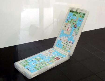
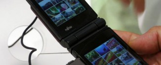
“So where’s the third screen, then?”, I hear you ask. Well, tow of the screens on the new Au “Actface” phone are where you’d expect them to be – on the outside of the phone and on the inside once it’s opened (the phone being a clamshell design).
The third screen is actually positioned beneath the keypad, and features animations that come to life whenever you push a button. This is similar to the design of the Optimus Maximus OLED keyboard, which has OLED screens beneath each key, letting each key display a different character according to what you’re using the keyboard for (typing, games, photoshop, Web browsing, etc.).
Of course the Optimus Maximus is intended for desktop use, where power isn’t an issue. Having three screens on a mobile phone is a different story, as the battery’s already under constant attack from the plethora of features contained in the modern mobile phone, such as camera, music player, and the wireless radio itself, all of which make their own power demands.
However, despite the seeming impracticality of a three-screened mobile phone, GearFuse reckon that a phone very similar to this might just make it to market, as Au have a history of releasing phones that are very close to the concept phones they display.
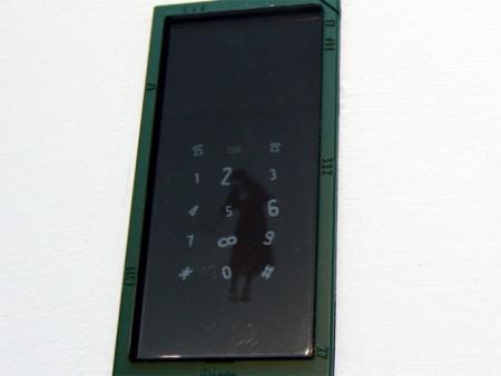
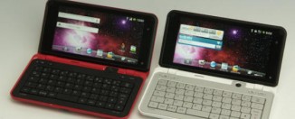
Also on display, though less likely to make it to production, is the Hitoca (above and below). The Hitaca at first glance appears to be a bit dull, but on closer inspection, it’s a giant slab of screen with a user interface that responds completely to what the user’s doing.
In this, the Hitaca is, unsurprisingly, similar to the iPhone and the LG Prada, and like those phones, its success will very much depend on how good its interface is. Mind you, beats me why this is a concept phone, as anyone can create a flat slab of plastic and say “it’s all about the interface”, without actually showing the interface in action!
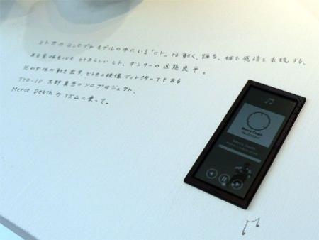
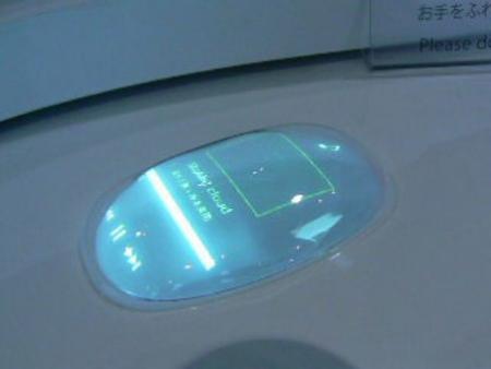
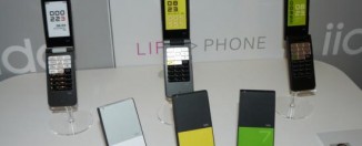
Finally, we have the Sorata (below), which is more pebble-like than the Motorola PEBL. Apparently the Sorata displays clouds and blue sky when on standby.
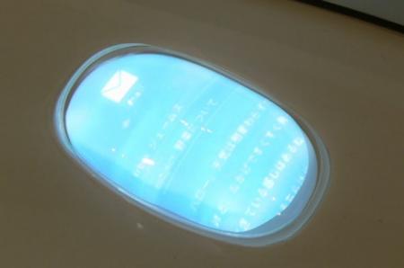
You know the standby feature, right? It’s the feature where your phone powers down when not in use to conserve battery power. You know, like turning off the display, rather than turning it on and showing clouds rolling past when the phone’s stuck in your pocket!
That aside, the Sorata does look pretty cool when actually in use (below), in an ethereal kind of way.


[…] this link for another example of why the US makes me cry about the fact that I have to deal with its […]