LG and Samsung’s next-gen User Interfaces
When you think of Korean phones from the likes of Samsung and LG, you think of marvels of technology, with phones crammed full of features, but with pretty ordinary user interfaces.
The superb Samsung Galaxy S, for example, has a crystal clear Super AMOLED display that even outshines the iPhone 4, yet its user interface isn’t quite on a par with the likes of HTC or Sony Ericsson’s redesigned Android interface.
It’s the same with LG. Although they’ve tried over the years, they’ve never quite come close to the aesthetics on offer from the likes of Apple, Palm and HTC.
Not any more, though. Realizing the world has moved on, and that the user experience is now just as important as the hardware underneath, both Samsung and LG have pulled their socks up and are working like mad on completely revamping the user interfaces of their next gen phones.
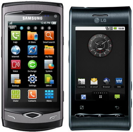
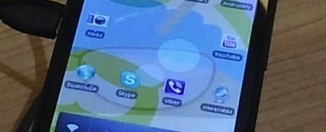
Samsung’s TouchWiz interface
Samsung has used it TouchWiz interface for a few yers now. It’s been used in everything from its small low-end phones, such as the Genio, right up to its latest high-end smartphone, the Galaxy S, which features the latst version, TouchWiz 3.
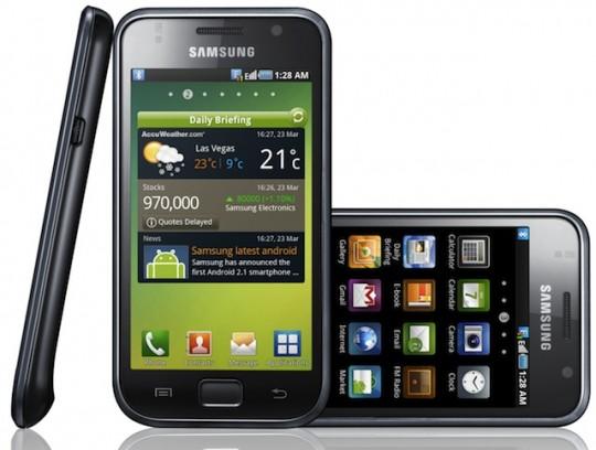
Although impressive in its own right, TouchWiz is not a patch on other user interfaces out there. And Samsung know it. So they’ve drafted in Uung Ji-hong, a professor of Visual Communication Design at Kookmin University, who will focus on Samsung’s TouchWiz 4 and beyond, with the aim of making the overall user experience as good as the best in the business.
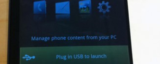
LG’s S-Class UI
LG, too, had a similar issue to Samsung. In LG’s case, they have their own S-Class user interface, but despite the nifty 3D cube on the homescreen, this too is not on a par with the best user experience you can buy.
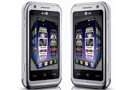
So, in a similar move to Samsung, LG have brought on board Lee Kun-pyo, who’s Dean of the Department of Industrial Design at the Korean Advanced Institue of Science and Technology.
Next-gen Korean UIs
So what can we expect from the next-gen Korean UIs? Well, hopefully more flair. At the moment, both TouchWiz and S-Class are perfectly capable user interfaces, but they’re a little flat. There’s not shine to them, at least compared to the interfaces from Sony Ericsson and HTC, never mind Apple.
This has always been a bit of a shame, as the technology underlying both manufacturers’ phones has been right at the very top of the field. The Galaxy S is an absolute screamer, for example, and excels as a smartphone with a repsonsiveness that’s simply superb.
But its user interface makes it a poorer option than an HTC Desire, at least in terms of overall user experience (although it’s certainly faster).
Alas, we have no clue as to what the future will actually bring, but it’s great news that both Kortean companies are working on the user experience. Coupling their outstanding hardware to some award-winning user interface design would surely lead ot some mouthwatering phones!
[Source: UnwiredView]

